Mapping Pittsburgh Potholes 1: Visualization
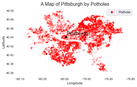
If you’re from a place that has harsh winters, you know about the horrors of potholes. In Pittsburgh, we have a non-emergency reporting service (311) where we can call in can let the city know that there’s a hole in the road. Thanks to the Western Pennsyvlania Regional Data Center, anyone can access the 311 data and see where the potholes are! In this post, I’ll just do a simple visualization to create a map of Pittsburgh entirely by its potholes. In future posts, I’ll delve much more into what determines how long it takes before potholes get filled.
Step 1: Load your libraries and data exploration
#LOAD PRIMARY DATA
import os
import numpy as np
import pandas as pd
from six.moves import urllib

%matplotlib inline
import matplotlib.pyplot as plt

import seaborn as sns
color = sns.color_palette()
sns.set_style('darkgrid')

import geopandas
from shapely.geometry import *

TDat = pd.read_csv('C:/Users/james/Desktop/Computer Club/PittsburghPotholeData/data311.csv')

TDat.head()
| REQUEST_ID | CREATED_ON | REQUEST_TYPE | REQUEST_ORIGIN | STATUS | DEPARTMENT | NEIGHBORHOOD | COUNCIL_DISTRICT | WARD | TRACT | PUBLIC_WORKS_DIVISION | PLI_DIVISION | POLICE_ZONE | FIRE_ZONE | X | Y | GEO_ACCURACY | |
|---|---|---|---|---|---|---|---|---|---|---|---|---|---|---|---|---|---|
| 0 | 203364.0 | 2017-12-15T14:53:00 | Street Obstruction/Closure | Call Center | 1 | DOMI - Permits | Central Northside | 1.0 | 22.0 | 4.200322e+10 | 1.0 | 22.0 | 1.0 | 1-7 | -80.016716 | 40.454144 | EXACT |
| 1 | 200800.0 | 2017-11-29T09:54:00 | Graffiti | Control Panel | 1 | Police - Zones 1-6 | South Side Flats | 3.0 | 16.0 | 4.200316e+10 | 3.0 | 16.0 | 3.0 | 4-24 | -79.969952 | 40.429243 | APPROXIMATE |
| 2 | 201310.0 | 2017-12-01T13:23:00 | Litter | Call Center | 1 | DPW - Street Maintenance | Troy Hill | 1.0 | 24.0 | 4.200324e+10 | 1.0 | 24.0 | 1.0 | 1-2 | -79.985859 | 40.459716 | EXACT |
| 3 | 200171.0 | 2017-11-22T14:54:00 | Water Main Break | Call Center | 0 | Pittsburgh Water and Sewer Authority | Banksville | 2.0 | 20.0 | 4.200320e+10 | 5.0 | 20.0 | 6.0 | 4-9 | -80.034210 | 40.406969 | EXACT |
| 4 | 193043.0 | 2017-10-12T12:46:00 | Guide Rail | Call Center | 1 | DPW - Construction Division | East Hills | 9.0 | 13.0 | 4.200313e+10 | 2.0 | 13.0 | 5.0 | 3-19 | -79.876582 | 40.451226 | EXACT |
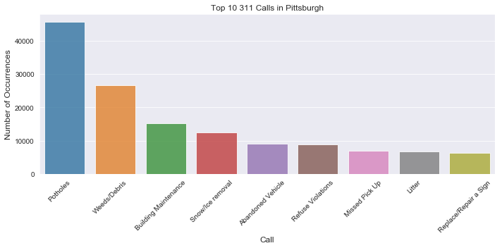
Ok, so you’ll notice that we don’t see “Potholes” in the header for “REQUEST_TYPE”. Let’s explore request types and see what are the most prevalent request:
#get a barplot of the top 10 311 calls

top10 = TDat['REQUEST_TYPE'].value_counts()[0:9]
top10.index.values[4] = 'Abandoned Vehicle' #I'm cheating a bit here to fix some formatting
plt.figure(figsize=(10,5))
sns.barplot(top10.index, top10.values, alpha=0.8)
plt.title('Top 10 311 Calls in Pittsburgh')
plt.ylabel('Number of Occurrences', fontsize=12)
plt.xlabel('Call', fontsize=12)

plt.xticks(plt.xticks()[0]-.1, top10.index, rotation=45)
plt.tight_layout()
plt.show()

Surprise, surprise! Potholes ARE the most common report by far.
Step 2: And lastly, plot all pothole longitudes and latitudes and you’ll see a clean outline of Pittsburgh:
#Now maybe do a group by potholes and display

#Remove NaN and focus our longitude and latitude ranges to the pittsburgh region
subDf = TDat[['REQUEST_TYPE','X','Y']].dropna()
subDf = subDf[(subDf.X >-80.1) & (subDf.X < -79.85)]
subDf = subDf[(subDf.Y >40.36) & (subDf.Y < 40.5)]

fig = plt.figure(figsize=(7,7))
ax = fig.add_subplot(1, 1, 1) # nrows, ncols, index

ax.plot(-79.96,40.47,'ro',alpha=1) #inoccuous point so we can output the legend
ax.legend(['Pothole'],fontsize = 12) #inoccuous point so we can output legend
ax.plot(subDf.X[subDf.REQUEST_TYPE=='Potholes'].values,subDf.Y[subDf.REQUEST_TYPE=='Potholes'].values,'r.',alpha=.03)
ax.plot(-79.9959,40.4406,'ko')

ax.annotate('Pittsburgh',(-79.9959,40.4406),xytext=(-79.994,40.445),fontsize=16)
ax.set_aspect('equal')
ax.set_facecolor((1,1,1))

plt.title('A Map of Pittsburgh by Potholes', fontsize = 16)
plt.ylabel('Latitude', fontsize=12)
plt.xlabel('Longitude', fontsize=12)


Leave a comment