Unsupervised brain mapping with Python (a data mining tutorial)
an image-processing flow for calcium imaging
Electrodes are devices that can be implanted in brain or nerve tissue to control brain-computer interfaces–devices that let people control computers or robotic limbs with thought. While this technology has already started to be translated for clinical use, there are still some elements that need to be optimized. Namely, implanting an electrode into the brain is very traumatic and can damage brain cells leading to decreased performance of the device.
In this tutorial, we look at how these implanted devices change neural activity. This work is largely inspired by work of Dr. Alberto Vazquez at University of Pittsburgh.
To do this, we are going to analyze live imaging data of calcium activity in a brain after electrode implantation and determine which regions of the brain are firing together (ie, highly connected). We’ll also learn some basic Python image processing techniques and how we can use scikit-learn to make inferences about biomedical imaging data.
Step 1: load all of the essential Python libraries for this project:
#Load all libraries
import os
import numpy as np
import pandas as pd
from six.moves import urllib

%matplotlib inline
import matplotlib.pyplot as plt

from scipy import stats

from skimage import io
from scipy.ndimage import zoom

from sklearn.cluster import KMeans
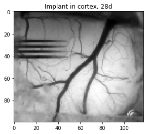
Step 2: Load the imaging data and show an image of the mean fluorescence over time
Data collected in this project are videos of brain activity collected with a CCD camera at a 20 frames per second. This way, we can visualize rapid changes in a transgenically expressed calcium sensor. I won’t go into the biology of the sensor here, but you can follow this link for more!
#Import image/ bin image to increase processing time / display mean image
#note: imread's order is z,y,x
im = io.imread('E:/Acute damage paper files/fluorscopedata/G432/20171107mouse_g43-2_gcamp__2p5x_rest1.tif')
bin_array = zoom(im, (1, 0.5, 0.5))
meanim = np.mean(bin_array, axis = 0)

#Display sample images
plt.imshow(meanim, cmap=plt.cm.gray)
plt.title('Implant in cortex, 28d')
plt.show()

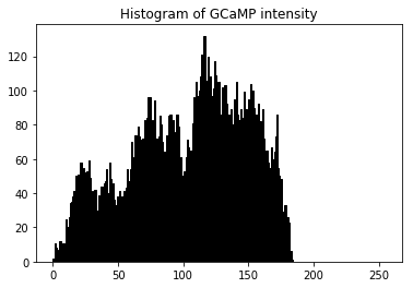
plt.hist(meanim.ravel(), bins=256, range=(0.0, 255), fc='k', ec='k')
plt.title('Histogram of GCaMP intensity')
plt.show()


To give you an idea of how the fluorescence is changing over time, let’s display the time course data for a couple of sample points (red and blue) from these images:
#Display a sample image to show what we mean by correlation
fig, axs = plt.subplots(1, 2, figsize=(11, 3), sharey=True)
fig.tight_layout()


axs[0] = plt.subplot(121)
axs[0].imshow(meanim,cmap=plt.cm.gray)
axs[0].plot(95,70,'ro')
axs[0].plot(35,52,'bo')


timevec = np.arange(0,6200)*.05

axs[1] = plt.subplot(122)
axs[1].plot(timevec, np.squeeze(bin_array[:,52,35]), lw=1, color='blue')
axs[1].plot(timevec, np.squeeze(bin_array[:,70,95]), lw=1, color='red')
axs[1].axis([0, 310, 0, 255])
axs[1].set_xlabel('Time (s)')
axs[1].set_ylabel('Fluorescence intensity')

plt.subplots_adjust(top=.8, wspace=0.2)

plt.suptitle('Sample time-traces of fluorescence activity')
plt.show()

Step 3: Now let’s see how the change in fluorescence signal of each XY location correlates with all other XY locations
We’ll simply rearrange this 3D image to a 2D image, and determine the Pearson’s correlation coefficient between all XY pixels
#Take correlation of all pixels with all other pixels

#First reshape the array so each column is a single xy pixel's time course
cform = np.transpose(bin_array, (1, 2, 0))
cform = np.reshape(cform,((cform.shape[0]*cform.shape[1]), cform.shape[2]))

#Now take the coercoeff of all pixels
corrmap = np.corrcoef(cform)
For our 2 sample points that we looked at previously, let’s generate heatmaps that show the Pearson’s coefficient between our sample points and all other points on the image. Warmer colors will be more correlated, cooler colors will be more anti-correlated.
#Let's look at correlated tissue for our sample points

fig, axs = plt.subplots(1, 3, figsize=(11, 3), sharey=True)
fig.tight_layout()

axs[0] = plt.subplot(131)
axs[0].imshow(meanim,cmap=plt.cm.gray)
axs[0].plot(95,70,'ro')
axs[0].plot(35,52,'bo')

#Here we need to generate the index values for our sample XY coordinates
testcoords = np.ravel_multi_index(np.array([[70,52],[95,35]]), (bin_array.shape[1],bin_array.shape[2]))

axs[1] = plt.subplot(132)
testloc1 = np.reshape(np.squeeze(corrmap[testcoords[0],:]),(bin_array.shape[1],bin_array.shape[2]))
im1 = axs[1].imshow(testloc1, vmin=-.2, vmax=1, cmap='jet')
plt.colorbar(im1)
axs[1].plot(95,70,'wo')

axs[2] = plt.subplot(133)
testloc2 = np.reshape(np.squeeze(corrmap[testcoords[1],:]),(bin_array.shape[1],bin_array.shape[2]))
im2 = axs[2].imshow(testloc2, vmin=-.2, vmax=1, cmap='jet')
plt.colorbar(im2)
axs[2].plot(35,52,'wo')


plt.subplots_adjust(top=.8, wspace=0.2)

plt.suptitle('Sample correlation heatmaps ')
plt.show()

Step 4: k-means clustering to define brain regions
From these correlation heatmaps, we should start to see that there are fairly distinct regions of correlated brain activity here. Let’s use k-means clustering, an unsupervised clustering algorithm that has a nice implementation in scikit-learn, to define those regions.
One thing about k-means clustering is that the algorithm will define as many regions as well tell it. So if we say k=3, it will define 3 clusters. If we say k = 100, it will define 100 clusters. From the above correlation heat maps, it looks like we might have 3 or 4 brain regions. So let’s run the Kmeans clustering algorithm with k = 3, 4, and 5 to see which one performs best.
#Perform kmeans with different number of clusters to optimize the cluster number

kmeans3 = KMeans(n_clusters=3, random_state=0).fit(corrmap)
kmeans4 = KMeans(n_clusters=4, random_state=0).fit(corrmap)
kmeans5 = KMeans(n_clusters=5, random_state=0).fit(corrmap)
#Display our clusters and make a determination about what captures the clusters best

fig, axs = plt.subplots(1, 3, figsize=(11, 3), sharey=True)
fig.tight_layout()

axs[0] = plt.subplot(131)
axs[0].imshow(np.reshape(kmeans3.labels_,(bin_array.shape[1],bin_array.shape[2])),cmap='jet')
plt.title("k = 3")

axs[1] = plt.subplot(132)
axs[1].imshow(np.reshape(kmeans4.labels_,(bin_array.shape[1],bin_array.shape[2])),cmap='jet')
plt.title("k = 4")

axs[2] = plt.subplot(133)
axs[2].imshow(np.reshape(kmeans5.labels_,(bin_array.shape[1],bin_array.shape[2])),cmap='jet')
plt.title("k = 5")

plt.subplots_adjust(top=.8, wspace=0.2)

plt.suptitle('Comparison of cluster counts for analysis')
plt.show()

It looks like there are 3 real clusters here, and then a 4th one that defines large blood vessels and the edge of the craniotomy. So we’ll go ahead and use k = 4.
Step 5: Run clustering for multiple time points to see if there is a change in clusters over time
We’ll first create a function to do all of our processing, and then run that function for image sets taken at 2 days, 7 days, and 28 days after implantation of the device.
#Now, let's make a function to pull all of our processing together

def imclust(filepath):
    fim = io.imread(filepath)
    fbin_array = zoom(fim, (1, 0.5, 0.5))
    fcform = np.transpose(fbin_array, (1, 2, 0))
    fcform = np.reshape(fcform,((fcform.shape[0]*fcform.shape[1]), fcform.shape[2]))
    fcorrmap = np.corrcoef(fcform)
    fkmeans4 = KMeans(n_clusters=4, random_state=0).fit(fcorrmap)
    remapclust = np.reshape(fkmeans4.labels_,(fbin_array.shape[1],fbin_array.shape[2]))
    return remapclust;
#Now Let's look at 2 more time points to see if there is change in clusters over time

d2 = 'E:/Acute damage paper files/fluorscopedata/G432/20171012mouse_G43-2_2p5x_gcamp_rest1.tif'
d7 = 'E:/Acute damage paper files/fluorscopedata/G432/20171017mouse_g43b_gcamp_2p5x_rest1.tif'

d2C = imclust(d2)
d7C = imclust(d7)
#Finally, let's display our results

#Display our cluster results from the
fig, axs = plt.subplots(1, 3, figsize=(11, 3), sharey=True)
fig.tight_layout()

axs[0] = plt.subplot(131)
axs[0].imshow(d2C,cmap='jet')
plt.title("2d post-implant")

axs[1] = plt.subplot(132)
axs[1].imshow(d7C,cmap='jet')
plt.title("7d post-implant")

axs[2] = plt.subplot(133)
axs[2].imshow(np.reshape(kmeans4.labels_,(bin_array.shape[1],bin_array.shape[2])),cmap='jet')
plt.title("28d post-implant")

plt.subplots_adjust(top=.8, wspace=0.2)

plt.suptitle('Changes in correlated brain activity after electrode implantation')
plt.show()


Leave a comment